Discover how every room in your home can be transformed with color psychology. It influences emotions, sparks creativity, and even changes how large or small a room might feel. When you consider the subtle ways color interacts with natural light or blends with existing furnishings, the results can be surprising. Different hues can motivate you, soothe you, or add a touch of flair you never realized you needed. Home decor becomes more than just a look it evolves into an immersive, mood-boosting experience.
Many people assume picking paint is purely a style decision, but the choices you make can ripple through your daily routine. A pale blue bedroom, for instance, can feel gentle in the morning sun, while a living room in warm terracotta might envelop you in an instant sense of coziness. Even adding a single accent wall in a bold shade can reflect your personality and redefine the tone of a space. If you’ve ever wondered why some colors spark immediate comfort or energy, it’s not random your mind and body respond instinctively to them.
Choosing a color palette is also about telling a visual story. Friends and family who step inside your home pick up on the vibe before they even notice the furniture layout. Subtle pastel walls might hint at a quiet retreat, while bold reds or oranges can announce that this is a place for lively conversation. The best part is that you can adjust your home decor over time. Colors aren’t permanent; you can embrace them or swap them out as your personal tastes evolve.
Whether you’re repainting for a fresh start or just looking to breathe new life into your living area, exploring mood boards is a fun place to begin. Experimenting with color swatches, fabric samples, and even pictures from magazines or online galleries can spark new ideas. Using those references, you can layer shades that complement one another or seamlessly flow from room to room. It’s a chance to refine your design scheme and infuse uniqueness into every nook and cranny.
Below, we’ll look at different ways color choices can speak to your emotions including practical home decor tips you can try. A small shift toward thoughtful color placement can bring harmony and satisfaction into your daily routine. Let’s explore how these captivating hues can revitalize your space.
Contents
The Emotional Influence of Color in Home Decor
Color has a strong impact on how a space is perceived, and it’s more than just a decorative element. When you enter a room, your eyes and brain react to the shades around you, and that creates an immediate emotional response. Soft, cool tones can help you think clearly or even unwind after a busy day, while vibrant, warm tones can kick your energy up a notch. Once you lean into this concept, it becomes second nature to select hues that enrich your feelings, not just your walls.
It also helps to pay attention to saturation and brightness. A bright and bold color can command attention, while a soft pastel version of the same color might elicit calmness. By striking the right balance, you can create spaces that feel uplifting, cozy, or anything in between. That freedom allows you to highlight each room’s purpose, reinforcing whether it should be a place of peace or a spot for gathering and fun.
Why Each Hue Matters
Every color family comes packed with its own emotional qualities. Reds often signal high energy or passion, perfect for a creative nook or a lively dining room. Greens can represent renewal, which works well in areas where you want to feel fresh and relaxed, like a bathroom or reading corner. Meanwhile, yellows can inspire positivity, adding a sunny outlook to kitchens or small workspaces.
Exploring various shades can also help tailor the final outcome. A navy blue bedroom might feel regal and encompassing, whereas a sky blue nursery might evoke airy freedom. Test samples to see how they mesh with natural and artificial light in different times of day. A color that feels perfect at noon might appear entirely different under warm evening lamps.
Warm Hues: A Vibrant Approach to Interior Design
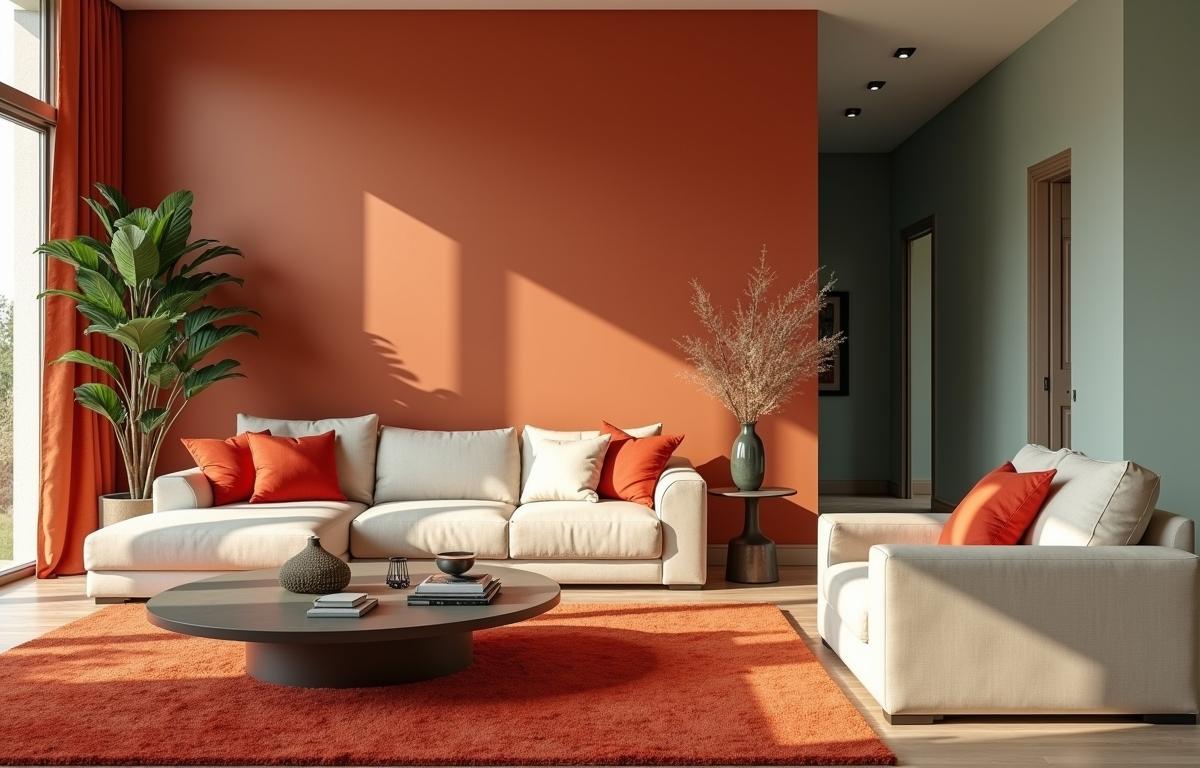
If you’re drawn to warmth in your home, consider shades of red, orange, or yellow. These hues are known for their ability to energize and stimulate conversation. A burnt orange living room, for instance, can envelop you in a welcoming glow. If painting an entire room sounds too dramatic, adding bold accents like a statement rug or a decorative piece can still weave that warmth throughout.
Warm hues have a knack for making a large room feel more intimate. By using them sparingly, you can bring life to neutral walls and furniture. These powerful colors also pair nicely with soft neutrals, allowing them to shine without overwhelming smaller spaces. Whether you go big with full coverage or pick a single wall as your canvas, warm colors spark vibrancy and character.
Reds, Oranges, and Yellows
Red is often associated with excitement and passion, making it a top pick for dining areas or entryways where you want to stimulate conversation. Orange channels warmth and creativity, which can be perfect for a hobby space or a family room that hosts game nights. Yellow, the brightest in this category, brings sunshine into darker corners. When combined with natural wood textures, these colors can create a homey, welcoming scene that feels both stylish and comforting.
Cool Tones for a Calm Retreat
For those who crave relaxation, cool tones like blues, greens, and purples can be an ideal match. A powder blue bedroom can calm you after a busy day, while soft sage green walls might remind you of a tranquil nature trail. You can even use deeper jewel tones, like emerald or sapphire, to lend a luxurious, soothing effect. These choices can feel refined without being dull.
Another advantage of cool colors is their ability to visually enlarge a cramped space. Light shades of blue or green reflect just enough light to create an airy, open atmosphere. This approach can be especially helpful in bathrooms, hallways, and smaller living areas. Combining varying shades of the same hue adds depth and keeps your color scheme from feeling too monotonous.
Blues, Greens, and Purples
Blue is a top choice for restful spaces, especially in a bedroom design scheme where you unwind. Green stands out for its versatility, often symbolizing growth or harmony try it in common areas where you gather to chat or share meals. Purple runs the gamut from a playful lavender to a sophisticated eggplant. Experimenting with accent pillows or decorative throws can be an easy way to test if a certain purple feels right before you commit to a full wall.
Neutral Shades and Their Harmonizing Effect
Neutral tones, such as beige, gray, and white, can be the unsung heroes of home decor. They form a calm backdrop that allows more vibrant colors to shine. Though these shades may seem modest, they’re the glue that ties your overall look together. By pairing soft neutrals with bold accent pieces, you create a balanced environment.
Neutrals also bring flexibility. If you want to switch out accent items seasonally, a neutral foundation makes it easy to refresh. Think crisp white walls with caramel-toned furniture or dove gray paint that softly coordinates with your favorite teal accessories. Layering textures like plush rugs or woven textiles on neutral floors can add another dimension of comfort and depth.
Infusing Bold Accents for Eye-Catching Details
Bold accents can come from more than just paint. Furniture choices, throw blankets, and even curtains can provide those unexpected pops of color. You can explore new accent color trends by testing items like scatter cushions or table linens in bright hues. This approach helps you maintain a timeless, neutral core while still letting your personality shine through.
Accents also create focal points in any room. A bright turquoise chair in a cream-colored living room draws the eye immediately. A magenta rug in an otherwise subdued corridor adds a dash of excitement. These touches invite curiosity and conversation, allowing you to highlight specific features or cozy corners in a fresh, delightful way.
Small Touches, Big Impact
Sometimes, the smallest details can make the greatest impression. A set of vividly colored bookends, eye-catching coasters, or a piece of abstract art on the wall can all serve as subtle but powerful statements. Even selecting one or two vibrant houseplants can elevate the mood with their lush green leaves and unique planters. By mixing colorful accessories with neutral staples, you strike the ideal balance between a cohesive look and individual highlights.
Practical Tips for Color Coordination
One of the best ways to keep your home decor feeling unified is to consider how colors flow from one space to another. Although each room can have its own personality, a soft transition from warm to cool tones or from neutral to vibrant shades can prevent any visual shock. This approach also ensures a sense of continuity as you move around.
Mood boards are a great tool to gather swatches of paint, fabric, and photographs in one place. If you’re aiming for a calming color palette in your bedroom, you could layer cool blues and fresh greens. If you love bold drama for a dining room, maybe incorporate darker jewel tones accented by metallic pieces. These combinations offer a chance to fine-tune your color strategy before you commit.
Try testing your chosen shades in different lighting throughout the day. Morning sunlight often reads cooler, while sunsets and indoor lamps can make colors appear warmer. Hang up small samples and see how they shift over time. This process prevents unexpected surprises after you’ve painted an entire wall.
Experimentation is key, and it’s perfectly fine to change course if something feels off. Sometimes even swapping out throw pillows or a single piece of artwork can pivot the atmosphere in a positive way. By continuously refining your colors and accents, you create a space that evolves alongside your taste. And, most importantly, you’ll notice how much of a difference thoughtful color psychology can make in your everyday life.